- Be organized
Work in an organized way and develop a workflow that suits you best. There are many workflows that can make your color grade process easier, faster, and more controlled. Here are a few examples:
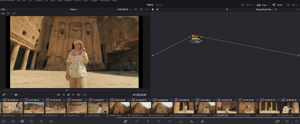
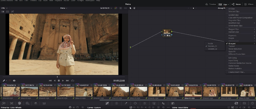
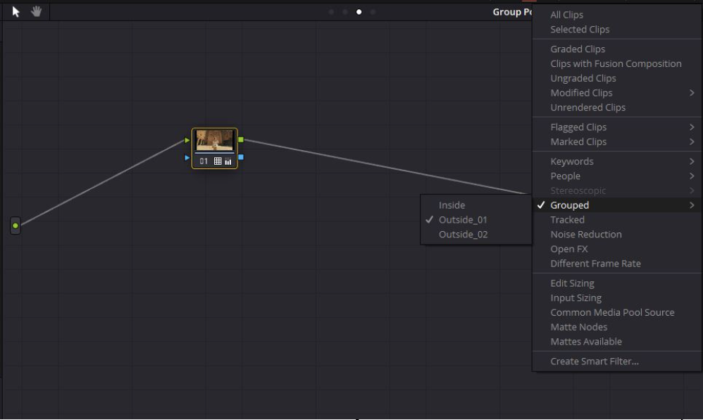
- Groups workflow: In the color tab divide your clips into groups according to scenes (location, lighting). Make basic corrections such as exposure, white balance, and contrast in the clip level and create a look at the group level. This will give a unified look to the entire scene.
- Unified tree structure: Make a tree that you feel comfortable with and make it as simple as possible. Save it as a power grade and now you can just paste it on the entire timeline. This can save you time and make you much more organized and precise.
- Timeline workflow (least recommended): Make your corrections in the clip level and create a look in the timeline level.
- Be simple
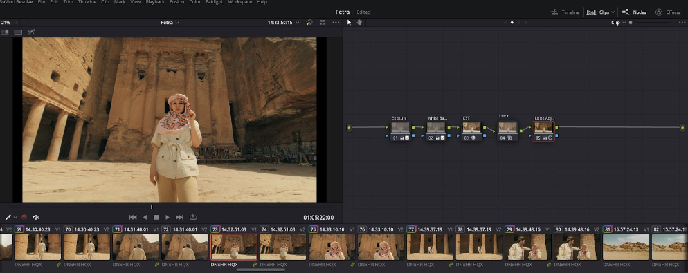
You can use a 5 node structure:
- Exposure
- White balance
- Transformation from LOG to Rec.709 (CST or LUT)
- Look
- Look adjustment

Creative tips
- Start by analyzing your scene
A good way to start is by analyzing your scene; look at the lighting and exposure to try to understand the world of the footage you’re grading. Then make corrections to the exposure, white balance, and contrast. Once you have the image in a Rec. 709 balanced state, start building a look.
Rec.709 means transformation (CST) from LOG to Rec.709 and balancing the shot to make it look like it looked on set. For example, if you have a very orange shot but it looks intentional by the cinematographer, you don't necessarily have to balance it in a way that makes it neutral.
- Know your peaks
When doing the first adjustment of an image, try to set your darkest and brightest levels using the Y-lift and Y-gain. Continue setting the tone of the image from there.
- Adjust your white balance
When trying to white balance a shot, don't assume the white is always white. For example, if the shot was filmed during a warm sunset it makes sense for the white to have a warm tint, so try to adjust the white balance to match what it looked like on set.
- Take breaks
Remember to take sun breaks every once in a while to refresh your eyes.
- Use references
Work with references from films and commercials, using frames from them to get interesting cinematic looks. You can download an image from Shotdeck or other websites, import it into DaVinci Resolve and try to copy the look. After you’re satisfied with the result, try to analyze why you like it and learn from it.
- Be consistent
Make sure to maintain a consistent color grade throughout your video.
- Create color separation in the shot
The most obvious example for this is teal and orange. You can create amazing monochromatic looks as well but even in that case, you can create subtle separation in the shadows and highlights.
- Make sure to plan ahead
Before you start the color grading process, plan the look you’re going for. Don’t just play around with color wheels, but rather have a clear image of what you want your grade to look like.